There are several organizations tracking protests spreading locally and globally. Remember that no site is perfect.
Always ask yourself the following questions:
When was the information posted (and how often is it updated)?
Who is posting this information? Is this person or organization funded by a specific company?
How accurate is the information that’s been posted?
What’s missing?
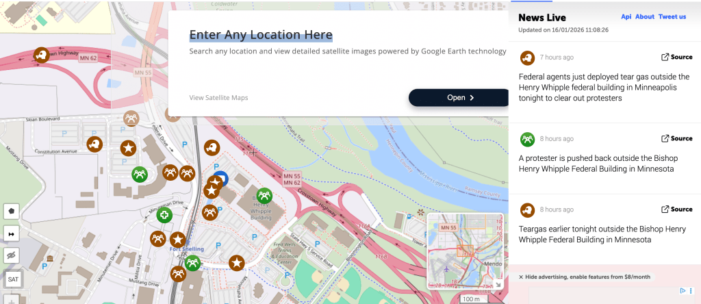
LiveuaMap
This has real-time information about ongoing protests. There’s are buttons at the top to help you navigate to different countries. In high conflict areas (e.g., Ukraine) there are also markers for violent incidents linked to sources on the right-hand “News Live” bar.
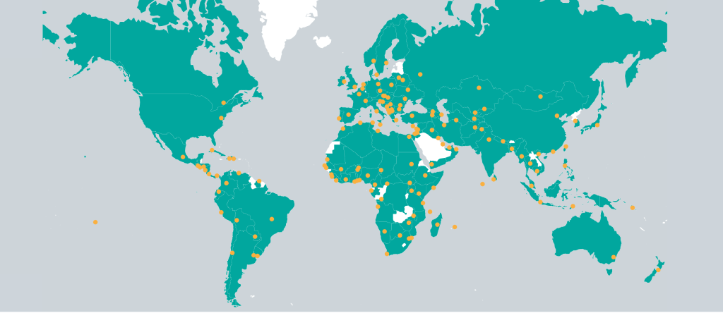
Global Protest Tracker
Created by: Carnegie Endowment for International Peace
“Use Carnegie’s Global Protest Tracker to analyze and compare the triggers, motivations, and other aspects of many of the most significant antigovernment protests since 2017. Designed for researchers, decisionmakers, and journalists, this comprehensive resource helps illustrate how protests impact today’s global politics.” Note, these protests are uploaded after-the-fact, so if you’re looking for current protests, this resource won’t be as useful; however, the website let’s you search maps based on topic or region– excellent resource if you’re researching the impacts of protects.
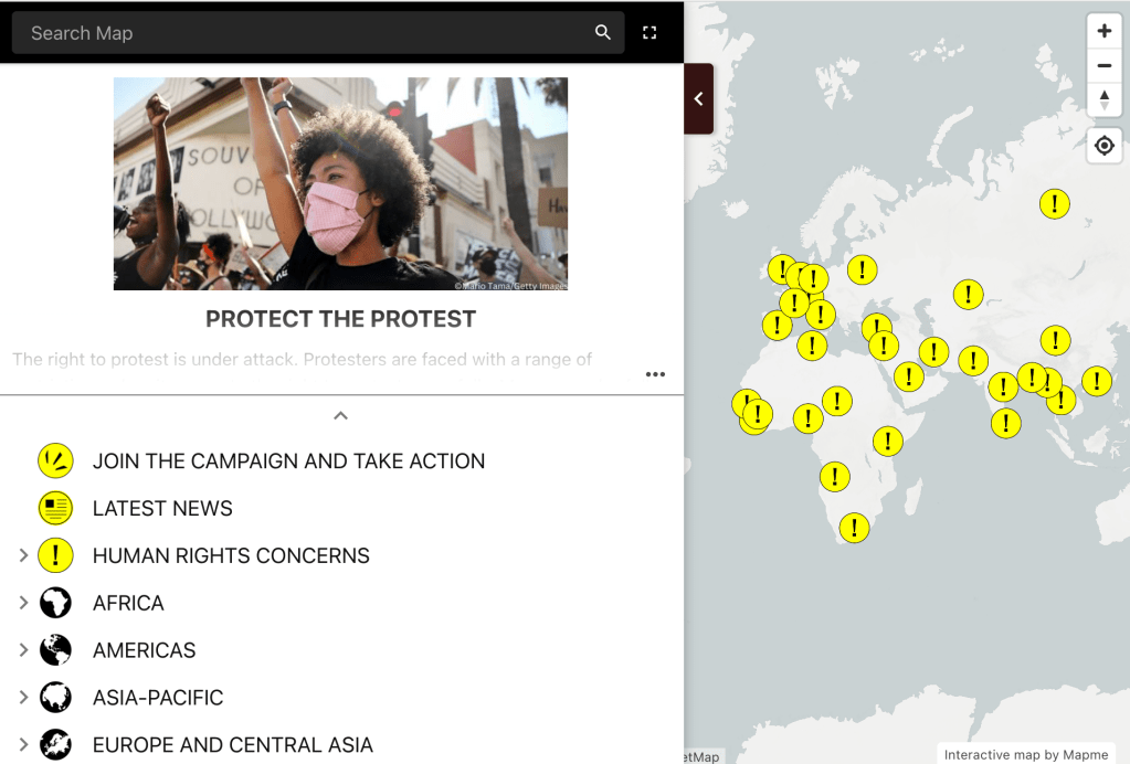
International Protest Map
Created by: Amnesty International
“This map shows how governments treat protests as a threat rather than a right and how law enforcement officials view their role as being to suppress and subdue protesters rather than to facilitate their rights. As a result, thousands of people are being unlawfully dispersed, arrested, beaten and even killed during demonstrations. They also face devastating consequences afterwards, just for participating in protests.” Pro-Tip: Use the drag-out panel on the left side to toggle between topics on the global map (e.g., Geographic location, human rights concerns, current news, and campaigns to join).
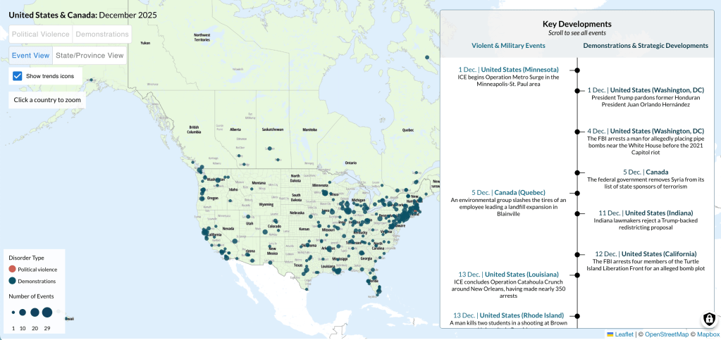
Demonstrations in the US and Canada
Created by: ACLED (Armed Conflict Location & Event Data)
“Opposition to Trump and his migration policy drove a dramatic increase in demonstrations in 2025, while demonstrations with the presence of armed demonstrators also grew.”
Note, the “Key Developments” section on the ACLED’s site is a helpful visual aid that contextualizes protests over a specific time period. As you can see, the authors, Bianca Ho and Kieran Doyle, are tracking timely information from 2020-present.
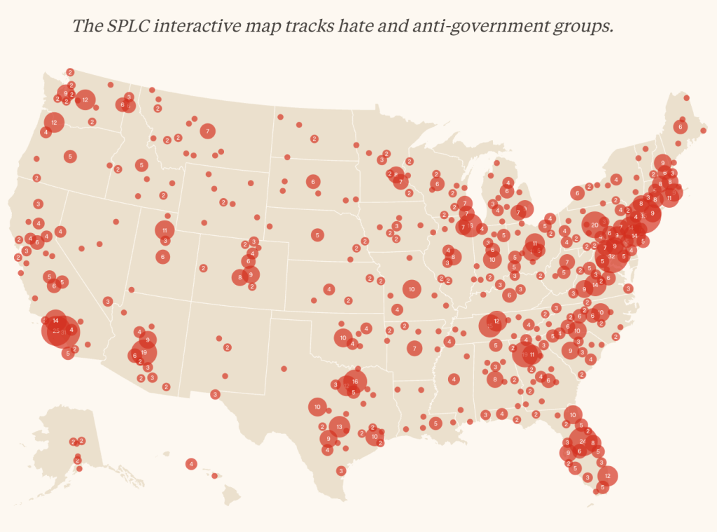
Hate Map
Created by: The SPLC (Southern Poverty Law Center)
This map tracks the amount of hate groups per capita both statewide and locally. Use the cream bars below the map to toggle between time periods (2000-2024) and hover over the map with your cursor to see specific ideologies (e.g., anti-LGBTQ+, anti-Government General, anti-Muslim, etc). Pro-Tip: Using this map in conjunction with one of the protest maps above will help you draw cause-effect relationships between hate groups and areas of mass protests in the United States. Note: This map only provides information on the United States.
Find a map I should add to this list? Send it to me via email and I'll review the source prior to posting.
Welcome to Ms. Conti’s Literature Lab! This site serves both my tutoring clients and my current students. Take a look around, learn something new, and reach out if you need help reaching your educational or personal goals.


Leave a comment